

A version of this blog post originally published on Google.Design. Hero animation by Payton Meyer, thank you Payton!!
Unicode 18.0 officially dropped yesterday and the world is getting new emoji like the ‘Pickle’ and 'Cracking Face.' Normally, I’m here breaking down encoding specs and standards docs. But today is different. To celebrate, I’d like to share our new 🚨dedicated home for Google’s emoji🚨 and the story behind our new 3D emoji. Stop what you’re doing and go check it out. I’ll wait.
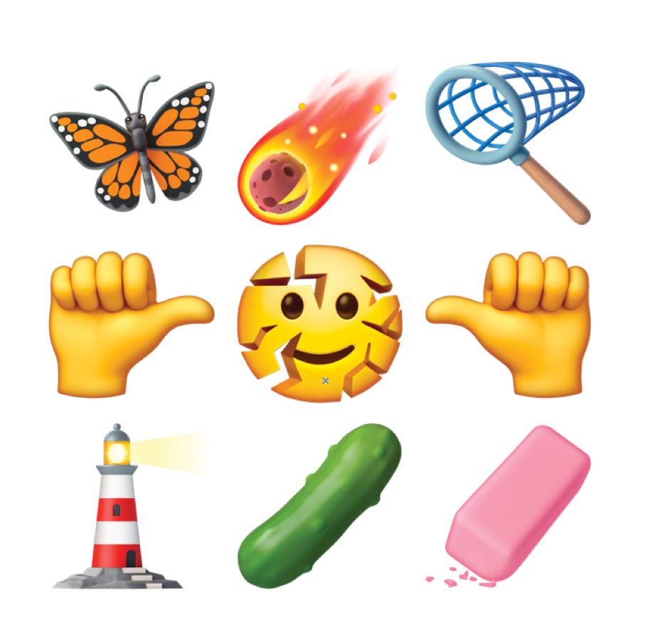
I know, I know. Why? Why touch something that is already … perfection? It’s a fair question. For years, emoji have done the emotional heavy lifting our keyboards couldn’t. But the way we talk online doesn’t look like it did a decade ago, and neither should our emoji. These new emoji, which Google is calling Noto 3D, give our rapid, fleeting exchanges more depth, a little bounce, and tangible presence to overcome our digital divide.
Of course, jumping into three dimensions solves one problem and presents a few new ones: What does the back of a smiley look like? How do we ensure emoji are just as legible at tiny emoji sizes and beautiful when displayed much larger on videos and photos? Instead of rushing into automated generation, we slowed down: crafting every single character by hand so that depth never came at the cost of soul.
The Kangaroo Rule: Expressive, Not Photorealistic
When you have the latest cutting-edge technology, there’s a temptation to show off and create hyperrealistic art just to flex what your tools can do: crank up the ray tracing, add subsurface skin scattering, and make everything look like a cold, industrial CAD demo.
But just because our software can render reality doesn’t mean we should. Especially when it comes to emoji.
Take a kangaroo: an anatomically accurate depiction wouldn’t look like a friendly, hopping mascot. It’d look like a vein-popping bodybuilder itching for a fight. Suddenly, a cheerful “omw! 🦘” text can read as a physical threat: I’m coming for you 🦘🦘🦘.
Instead of treating emoji as miniature scans of the natural world, we prioritized emotional clarity. Our job was to preserve the vibe behind each symbol: using 3D to give the character a body, but illustration to give it a soul.

Less Face, More Feeling
Steering clear of the uncanny valley isn’t simply an aesthetic preference. Research led by Dr. Alexander Robertson revealed that highly anatomical details like irises or nostril depth actually slow down how fast our brains process emotion. Stripping away extraneous detail and keeping facial geometry minimal keeps the expression universally readable.
Those micro-expressions carry surprisingly high stakes. Flipping the direction of a wink or slightly shifting an eyebrow can turn playful teasing into perceived aggression, especially when translating across different operating systems.
The 360-Degree Reality Check
In 2D illustration, you only have to solve for a single vantage point. In 3D, there’s nowhere to hide. Once we started imagining the 360-degree view of our assets, we started confronting questions Unicode never warned us about: What does the back of a smiley face look like?
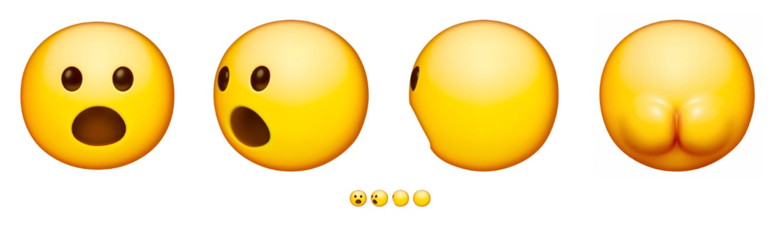
Just kidding! Butt, IMAGINE!
In 3D, we have to invent the unseen, finding the truth of a symbol so it feels warm and intentional from every perspective.
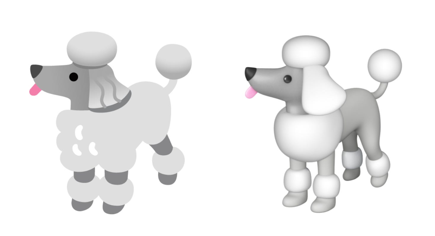
The back of a smiley face doesn’t require a lot of imagination, but rotating the camera revealed some hilarious legacy drawing crimes. In 2D, our poodle looked ready for Best in Show. But the second we started sculpting her in 3D, we realized she only had three legs. The fourth had been tucked out of sight behind the front two. (Rest easy. She now has all four.)
Changing our view also changed how we framed characters entirely. Some emoji only appear as disembodied floating heads. But Robertson’s research demonstrated that people empathize far more with complete silhouettes, especially when it comes to depicting real animals. Seeing an animal’s stance, paws, and posture helps communicate intent. Upon learning this last year, we updated a few animal emoji, like the raccoon, to embrace its full mischievous self. Now in 3D.
The 18-Pixel Stress Test
A 3D canvas, with its endless possibilities, can encourage over-sculpting. Though we occasionally gave in to our childhood fantasy of being a unicorn groomer, we realized that designs that deviated too much from our original beloved drawings suffered. Our research validated that excessive props and texture destroy comprehension. Background features and accessories might look charming at hero scale, but at 18x18 pixels inside a chat bubble, that detail just becomes visual static.
To protect the legibility of our emoji, we stuck to a simple design rule: Every emoji gets at most three essential details to communicate what it is. For the volcano, that meant just the mountain shape and the molten lava flow. Everything else was cut.

Fixing the Dark-Mode Problem with Math
While every emoji was shaped by human hands, ensuring that emotional clarity could scale across thousands of screens required an assist from automation.
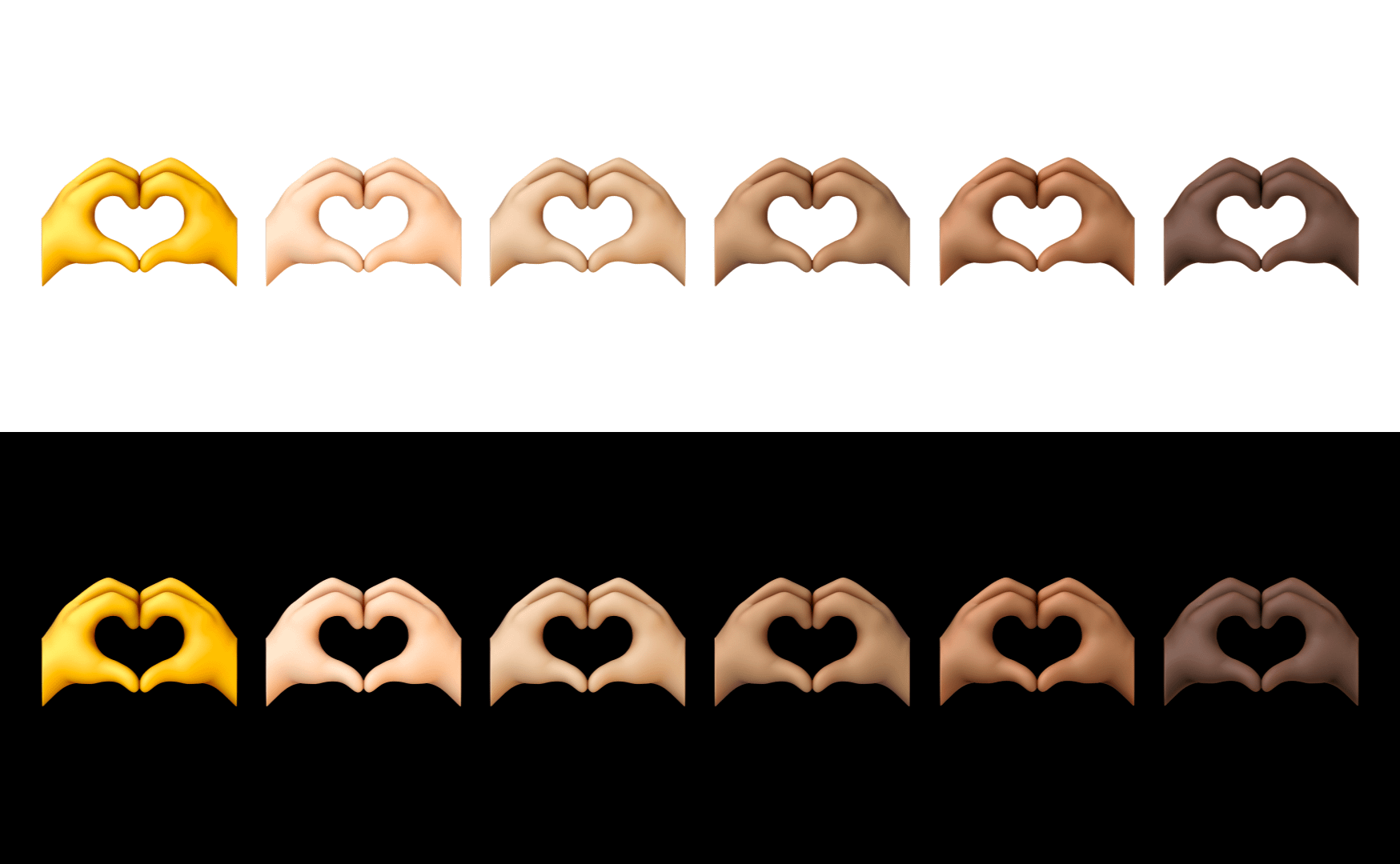
An emoji’s first job is to be understood at a glance, but that breaks down completely if people can’t actually see the character: for example, a black cat on a black background. In dark mode, people who use darker skin tones have long faced an annoying reality: Their emoji often disappear against black or dark-gray chat bubbles. When the silhouette vanishes, so does the meaning.
We wanted to fix this issue across all 3,977 characters, while understanding that designers can’t reliably eyeball thousands of combinations. To shoulder the mathematical heavy lifting, we built an AI-powered contrast audit tool.
As Wilder Wells, our program operations manager, explains, “High color contrast along the image edge is a key factor for legibility at small sizes, so we built a tool that scans the edges, flags when the contrast is below the threshold against common backgrounds, and suggests visual improvements that designers could implement.“
While the algorithm flagged the failures, it didn’t solve them. An automated filter would have washed out rich skin tones just to pass the test. Instead, our designers stepped in to manually sculpt custom edge protection — painting subtle rim lighting and contour highlights by hand.
Nobody should have to choose between using their actual skin tone and having their messages be legible. Whether someone sends an emoji in the default yellow hue or tone 5, their identity should never be an accessibility trade-off.
Hand-Crafted by Humans, Open to the World
In an era dominated by instant generation, there’s quiet power in stubborn, deliberate craft. Every curve and detail exists because a designer cared enough to think about it. We let algorithms handle the contrast math, but humans shaped the soul.
A design system only feels alive when people can actively tear it apart and remix it. Take it somewhere we could have never expected. Emoji don’t belong to anyone. They belong to the people who use them. Noto Emoji continues to be open source so everyone can use them.
Alongside their rollout across Google and Android, you can find the new files on our new website, free for the creative community to use. This will make it easier for everyone to drag and drop our 3D assets into slides, Figma, or anywhere that supports bitmap images.
Go make something weird. ⛲
___
Where to find Noto 3D: You can find the entire Noto 3D emoji collection here. Noto 3D will be available across Google, starting with Pixel phones, later this year. Over time, it will expand to more Google apps and select devices
Hi 👋🏼
Obsessed with the butt on the smiley face.
P.S. Would there ever be a website or devlog for emoji kitchen for like when new ingredients or combos are added?
Hey Jennifer i have One Question. If Theres was one Emoji from Unicode 6.0 you would remove. What would it be (Yes i know once they are approved they won’t be deleted forever but i was wondering)